In the world of interior design, opposition isn’t just a political term; it’s the secret sauce that transforms a bland space into a breathtaking masterpiece. Imagine walking into a room where bold colors clash with soft textures, and sleek lines dance with organic shapes. It’s not chaos; it’s a carefully orchestrated symphony of contrasts that keeps the eye engaged and the mind intrigued.
Table of Contents
ToggleUnderstanding Opposition in Interior Design
Opposition in interior design refers to the intentional use of contrasting elements to create depth and visual interest. This concept plays a crucial role in elevating spaces from ordinary to extraordinary.
Definition and Importance
Opposition involves pairing differing features, such as bold colors against muted tones or smooth surfaces with textured elements. These contrasts create tension and interest, enabling designers to guide the viewer’s eye throughout a space. Such elements not only contribute to the aesthetic appeal but also enhance the functionality of a room. Creating visual balance fosters a sense of harmony, allowing the differing attributes to coexist cohesively. Recognizing the value of opposition contributes to a more dynamic and engaging environment.
Historical Context
Throughout history, designers have embraced opposition to shape aesthetic trends. In the mid-20th century, the Modernist movement highlighted stark contrasts, showcasing minimalistic design against vibrant artworks. Designers like Le Corbusier used opposing concepts to create striking spaces that emphasized functionality. In turn, postmodernism sought to juxtapose traditional and contemporary elements, challenging established norms. Each era showcased the significance of opposition as a pivotal factor in interior design, reflecting society’s evolving tastes and preferences.
Elements of Opposition in Interior Design
Opposition plays a crucial role in creating visually appealing spaces. Various elements contribute to this concept, making each room uniquely engaging.
Color Contrast
Color contrast significantly influences the mood and energy of a space. Bold colors, such as deep red or vibrant blue, can energize a room when paired with softer hues like pastel pink or muted gray. Utilizing complementary colors adds depth and can direct attention to focal points. A well-balanced color palette enhances visual interest without overwhelming the senses. For instance, a bright yellow sofa against a neutral wall creates a striking centerpiece.
Texture and Material Differences
Texture variation introduces tactile interest, enriching the overall sensory experience. Smooth surfaces from glass or metal can effectively contrast with rough materials like reclaimed wood or woven fabrics. This interplay adds dimension to a design, drawing the eye and inviting touch. Mixing textures enhances depth, creating layers within a space. An example includes pairing sleek leather chairs with a cozy, knitted throw, which provides warmth and comfort.
Shape and Form Variations
Shape and form variations contribute to an engaging architectural layout. Combining geometric shapes with organic forms creates a dynamic atmosphere in a room. For example, circular pendant lights can juxtapose with square tables, bringing visual tension and excitement. Curvy elements soften rigid lines, resulting in a harmonious flow within the design. Implementing these contrasts encourages movement through the space, enhancing its functionality.
Application of Opposition in Design Concepts
Opposition in interior design manifests through the juxtaposition of different styles and elements. This approach enhances visual engagement and creates dynamic environments.
Modern vs. Traditional Styles
Contrast between modern and traditional styles sets a vibrant tone in interior spaces. Modern design emphasizes clean lines and minimalism, while traditional styles embrace ornate details and rich textures. By blending these contrasting elements, designers can introduce a unique narrative to a room. For instance, pairing a sleek, contemporary sofa with an antique coffee table creates a striking focal point. This combination highlights the simplicity of modern furniture against the intricate craftsmanship of traditional pieces. The balance between these styles fosters an environment that feels both contemporary and timeless.
Minimalism vs. Maximalism
The tension between minimalism and maximalism generates strong visual interest in interior design. Minimalism focuses on simplicity, using limited decor and a neutral palette to create calm spaces. Maximalism, in contrast, embraces bold colors, patterns, and an abundance of furnishings. Mixing the two styles results in a fascinating interplay of elements. A single statement piece, like a colorful artwork, can create a point of interest within an otherwise minimalist room. This thoughtful combination allows for vibrant creativity without overwhelming the senses, resulting in a balanced aesthetic that draws the observer in.
Case Studies of Successful Opposition in Interior Design
Successful opposition in interior design showcases distinctive contrasts that enhance both functionality and aesthetic appeal in various settings. From residential spaces to commercial environments, utilizing elements of opposition creates captivating designs.
Residential Spaces
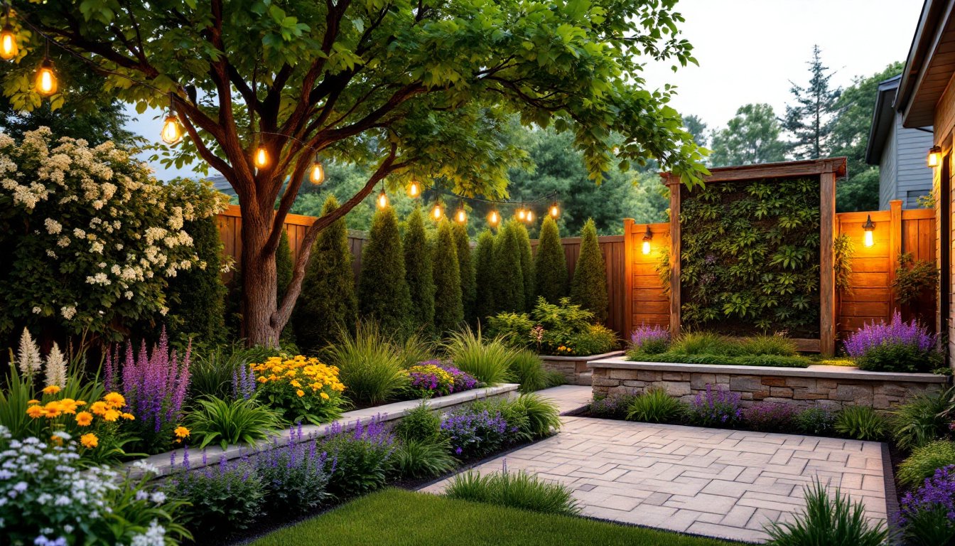
In residential interiors, the blend of opposing features transforms ordinary homes into extraordinary spaces. Combining bold colors with soft hues invigorates a room, promoting a dramatic yet harmonious atmosphere. Mixing textures, like smooth leather sofas paired with chunky knit blankets, adds depth and tactile interest. Designers often juxtapose geometric furniture with organic decor elements, creating a balanced visual narrative. For example, a minimalist dining table surrounded by upholstered chairs achieves warmth while maintaining modern simplicity. These contrasts encourage creativity and ensure each room feels inviting and visually stimulating.
Commercial Environments
Commercial spaces benefit significantly from the use of opposition to create engaging experiences for clients and employees. High-contrast color schemes, such as pairing rich navy walls with vivid orange accents, energize workspaces. Textural contrasts are vital in offices, where sleek glass partitions coexist with rustic wood furniture to foster creativity and collaboration. Juxtaposing modern minimalism with eclectic art installations can transform a sterile environment into a vibrant hub. Notable examples include retail stores that mix exposed brick walls with contemporary fixtures, effectively blending industrial charm with luxury. These tactics not only attract attention but also enhance the overall functionality of commercial settings.
Embracing opposition in interior design opens up a world of creative possibilities. By thoughtfully combining contrasting elements, designers can craft spaces that are not only visually stunning but also functional and engaging. The interplay of bold colors and soft textures or geometric shapes and organic forms invites exploration and interaction.
This approach not only enhances aesthetic appeal but also reflects the evolving tastes of society. As designers continue to experiment with opposition, they create environments that resonate with individuals on multiple levels. Ultimately, the art of opposition transforms spaces into captivating experiences that inspire and delight.