A room that feels flat, monotonous, or one-note rarely holds anyone’s attention for long. Variety is what transforms a space from merely functional to genuinely captivating, it’s the spice that keeps the eye moving, engages the senses, and gives a room personality. But here’s the catch: too much variety creates visual chaos, while too little leaves a room feeling sterile. Mastering variety in interior design means knowing how to layer color, texture, pattern, and form in ways that create interest without overwhelming the space. This guide walks through practical strategies for introducing variety that works, whether someone’s tackling a single room refresh or planning a whole-home update.
Table of Contents
ToggleKey Takeaways
- Variety in interior design balances contrasting elements like color, texture, pattern, and material to create visual interest without overwhelming the space.
- The 60-30-10 color rule and the rule of three for patterns provide practical frameworks for introducing variety while maintaining cohesion.
- Mixing furniture styles, eras, and silhouettes creates a collected-over-time feel that’s more compelling than matching sets.
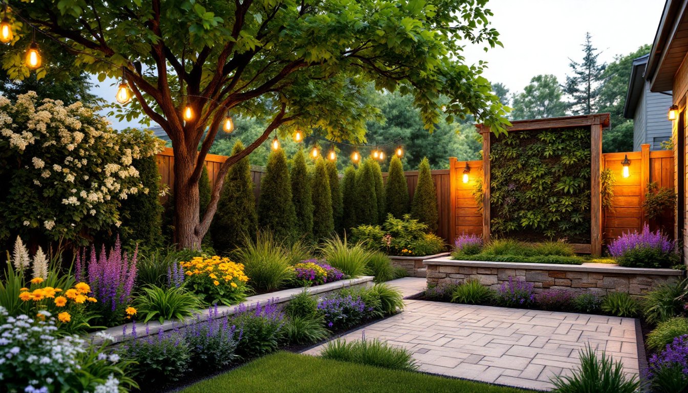
- Texture is variety’s secret weapon, especially in neutral schemes—layering different materials like wood, metal, glass, and fabric adds depth without extra color.
- Variety only works intentionally when paired with unity; every contrasting choice should tie back to the room’s overall palette, theme, or design direction.
- Common mistakes include confusing variety with randomness, overloading small spaces with too many competing elements, and ignoring scale relationships between furniture pieces.
What Is Variety in Interior Design?
Variety refers to the intentional use of contrasting or differing elements within a space to create visual interest and prevent monotony. It’s one of the fundamental principles of design, alongside balance, rhythm, emphasis, and unity. Without variety, a room risks feeling flat or lifeless, think of an all-white bedroom with identical furniture pieces and zero textural contrast.
Variety shows up in multiple ways: through color (a neutral palette punctuated with jewel tones), texture (smooth velvet cushions against a rough jute rug), pattern (mixing stripes with florals), scale (pairing a bulky sectional with delicate side tables), and material (wood beams contrasting with metal light fixtures). The goal isn’t to throw everything at the wall but to introduce enough difference that the eye has somewhere to travel.
It’s worth noting that variety works hand-in-hand with unity. A room needs a cohesive thread, whether that’s a consistent color temperature, a repeated material, or a unifying style direction, to prevent the variety from tipping into chaos. Think of unity as the foundation and variety as the accent work that brings it to life.
Why Variety Matters for Creating Dynamic Spaces
Spaces without variety feel stagnant. The human eye craves stimulation and movement, and when every element in a room matches too closely, there’s nothing to hold attention. Variety creates visual rhythm, it guides the gaze from one focal point to another, establishing a natural flow through the space.
From a practical standpoint, variety also helps define zones within a room. In an open-concept living area, using different furniture styles or flooring materials can signal where the dining space ends and the lounge begins without needing physical walls. It’s a subtle but effective way to organize space.
Psychologically, variety keeps a space from feeling predictable or boring. Rooms with thoughtful contrast feel more layered and lived-in, which translates to comfort. A well-designed space should reveal itself over time, there should be details that someone notices on the second or third look, not just an immediate visual download. That depth comes from deliberate variety in materials, finishes, and forms.
That said, variety for variety’s sake doesn’t cut it. Every contrasting element should serve a purpose, whether it’s adding warmth, drawing the eye to a feature, or balancing proportions. Random eclecticism just reads as clutter.
How to Add Variety Through Color and Pattern
Color is one of the most accessible ways to introduce variety, but it requires restraint. Start with a base palette, typically two to three neutrals, and layer in one or two accent colors. The 60-30-10 rule is a practical guideline: 60% dominant color (walls, large furniture), 30% secondary color (upholstery, rugs, curtains), and 10% accent color (pillows, artwork, accessories).
Pattern works similarly. Mixing patterns adds energy, but the key is varying the scale and type. Pair a large-scale geometric print with a smaller floral or stripe to avoid visual competition. For example, a bold chevron rug can anchor a room with smaller-scale patterned throw pillows on the sofa. Stick to a shared color thread across patterns to keep cohesion.
Colorful interior design doesn’t have to mean a rainbow explosion. Sometimes variety comes from temperature shifts within a single color family, cool grays with warm taupes, or icy blues with deeper navy accents. That subtle contrast keeps things interesting without clashing.
When in doubt, use the rule of three: combine three different patterns in a space, ensuring they vary in scale and share at least one common color. This approach is forgiving and avoids the “matchy-matchy” trap that kills variety. Don’t shy away from mixing styles, traditional damask can sit comfortably next to a modern abstract print if the colors harmonize.
Creating Variety With Texture and Materials
Texture is variety’s secret weapon, especially in neutral or monochromatic schemes. A room can use the exact same color on every surface and still feel dynamic if textures differ, think linen curtains, a wool rug, leather seating, and a glossy ceramic lamp base all in shades of cream.
Materials play a huge role here. Mixing wood, metal, glass, stone, and fabric in a single space adds tactile and visual interest. A dining room benefits from pairing a raw-edge wood table with upholstered chairs, metal pendant lights, and a stone or concrete accent wall. The variety in finish, matte, polished, brushed, textured, creates layers without needing additional color.
Don’t overlook smaller textural details. Woven baskets, nubby throws, ribbed cushions, and hammered metal hardware all contribute. In a living room, layering a jute rug under a plush shag or sheepskin adds depth underfoot. On a bed, mixing percale sheets with a chunky knit throw and velvet pillows does the same.
One caution: too many competing textures in a small space can feel cluttered. In tighter quarters, limit high-contrast textures to two or three and let them shine. For example, interior design for small spaces often benefits from a smoother base with selective textural accents rather than an all-over approach. According to Decoist, layering textures thoughtfully can make even minimalist interiors feel warm and inviting.
Using Furniture Styles and Shapes for Visual Interest
Furniture is where variety can make or break a room. Matching sets, bedroom suites, living room collections, are convenient but rarely interesting. Mixing furniture styles, eras, and shapes creates a collected-over-time feel that’s far more compelling.
Start by varying silhouettes. If the sofa is low and horizontal, balance it with a tall bookshelf or a high-backed accent chair. Pair round side tables with a rectangular coffee table. Use a mix of open and closed storage, floating shelves next to a solid credenza, for instance. The variety in form keeps the eye engaged.
Style mixing is equally effective. A mid-century modern credenza can anchor a room with traditional upholstered seating and industrial metal lighting. The key is choosing pieces that share a common thread, scale, color tone, or material, so the mix feels intentional rather than random.
According to research from MyDomaine, blending furniture styles has become a hallmark of contemporary interiors, moving away from rigidly themed rooms toward more personalized, layered looks. Don’t be afraid to introduce vintage or antique pieces alongside new ones. A refinished mid-century dresser next to a modern platform bed adds character and history.
Pay attention to leg styles, too. Tapered legs, hairpin legs, turned legs, and blocky bases all create different visual weight. Mixing these subtly shifts the room’s rhythm. Just avoid going overboard, stick to two or three distinct furniture styles in a single space to maintain coherence.
Common Mistakes to Avoid When Adding Variety
The biggest mistake is confusing variety with randomness. Throwing together unrelated colors, patterns, and styles without a unifying element results in visual noise, not interest. Every contrasting choice should tie back to the room’s overall palette, theme, or material story.
Another pitfall: overloading small spaces. Variety works best when there’s room to breathe. In a compact room, too many competing textures, colors, or furniture styles can feel chaotic. Edit ruthlessly. Choose one or two areas to emphasize variety, say, textiles and lighting, and keep the rest simple.
Ignoring scale is a common error. Mixing furniture of vastly different sizes without purpose can throw off a room’s proportions. A tiny side table next to an oversized sectional looks like an afterthought unless it’s balanced by other scaled elements. Use variety in scale intentionally to create hierarchy, not accident.
Avoid the all-or-nothing trap. Some homeowners go monochrome out of fear, while others pile on every trend at once. The sweet spot is somewhere in the middle. Start with a neutral foundation and layer in variety gradually. If something feels off, it’s easier to remove an accent pillow than repaint walls.
Finally, don’t skip the prep work. Variety only reads as intentional when the underlying space is thoughtfully planned. That means proper lighting (ambient, task, and accent), a clear furniture layout, and clean sightlines. Adding variety to a poorly lit or poorly arranged room won’t fix the fundamentals. Exploring opposition in interior design can help clarify how contrasts should function within a cohesive plan. For deeper guidance on foundational principles, interior design concepts offers a strong starting point.
Conclusion
Variety isn’t about stuffing a room with every color, texture, and style available, it’s about deliberate contrast that creates movement and interest while maintaining unity. Done right, it transforms a flat, forgettable space into one that feels layered, dynamic, and uniquely personal. Start small, trust the process, and edit as needed.